20 Details You Should Always Include on Your Event Website
An event website is practically a cost-free digital advertisement for the event you’re organizing. But even though it’s relatively easy to create a page, you want to make sure attendees are prepared with the details. To ensure it’s effective, make sure to add these 20 important details when building an event website.
[Tweet “Your website is a cost-effective way to advertise your upcoming event.”]
1. Compelling event descriptions
The event description is one of the most crucial elements of the event website.
It needs to be clear, concise, and have a strong CTA to drive attendees to purchase a ticket or secure an RSVP. Don’t forget to make sure it’s written well, free of typos and grammar mistakes. Even though writing a few sentences may seem easy, it can still be a tricky task for less experienced writers. If you need a hand, you can always employ the writing help of writing services like EssaysOnTime or Fiverr.
2. Company info and contact information
Adding company information and contacts is the idea which makes sense. This way, you will allow potential guests and clients to approach you and ask about the other details of your event, so don’t make a rookie mistake and forget to provide them with some basic information.
3. Impactful main/ landing page
People usually trust their first impressions, which is why you need to create an impactful landing page. It has to be customer-friendly and informative enough, but also visually attractive and intriguing to garner clicks to learn more.
4. Event schedules: date and time
You know how you sometimes just seem to forget even the most important dates? Potential attendees will also have the same problem when it comes to your event. For that reason, you need to emphasize date and time on the event website.
5. Add-to-calendar button
With so many events happening on nearly every night of the week, you want your event to stand out. If you want to make sure attendees won’t forget your event, make it easy for them. Offer them the add-to-calendar button and they will be just one click away from your event.
6. Venue location/ addresses
The event web page must also contain venue location with the correct address. But don’t stop there: include transport solutions, directions, and maps. This page is key especially if the event venue is difficult to find or get to. Doing so, you will make it easier for the visitors to organize their time and the means of transport.
[Tweet “Make the event venue location clear with location, address, maps, and tips for arrival.”]
7. Social media links
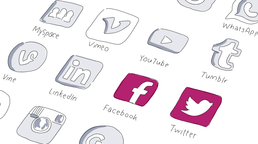
Don’t forget the social media preferences of your event attendees. Facebook alone has more than two billion active users, while millions of people prefer networks like Twitter or Instagram. But just remember that your attendees won’t necessarily be on every social network. But keep the links handy: it’s a practical way to keep your audience informed and engaged before the event happens. So be sure to keep those social media links handy on the website.
8. Speakers
Prominent speakers give your event more credibility and attract even those persons who didn’t want to come in the first place. Don’t let attendees guess who is going to address them and make the list of your speakers clear on the website.
You may also want to include bio information, speaker session times, and their social media information.

9. Agendas, sessions, activities
Any event should have a clear agenda with timetables and locations. Let it be visible on the website so that potential attendees can think about planning their day around sessions, breaks, and networking opportunities.
[Tweet “Listing your speakers on your event website can build credibility for your event.”]
10. Registration form and confirmation email
We can bet that you are a nice person but you don’t organize an event just because you love indulging people. On the contrary, your aim is to sell as many tickets as possible. Therefore, you need to highlight the registration form and make the registration process as clear as possible allowing interested followers to apply anytime they want. Make sure to send a confirmation email right after they register to acknowledge the fact of registration.
11. Ticket purchase and refund policy
What do you usually do when you find no way to buy a ticket for an upcoming event you’d like to attend? In most cases, you would just leave the site and try to find this opportunity with another one. Or, you will have to make calls or send an email to the support service to solve the issue and take a loss on the ticket.
Why lose your customers or complicate the process of buying tickets? Add a ticket purchase button to let your clients do this quickly without any hesitation. Moreover, add a refund policy page with clear terms and conditions in case they change their mind or can’t take part in the event.
12. Eye-catching visuals and videos
Humans are visual creatures and they will notice images and videos first. That’s why you should add a few eye-catchy images and the-best-of videos from your earlier events to boost interest among your target audience.
13. Your packages and offerings
Being an event organizer, you probably don’t plan only one package of activities. For that reason, you need to add information about all offerings and arrangements for the visitors.
14. Call to action
A simple call to action can do miracles for your event. Make the call to action clear: sign up, invite friends, share that you’re attending. Whatever the action is that you want attendees to take, make it clear on each page. Be sure to not muddle the pages with multiple CTAs and make it clear what you want attendees to do.
15. Social proof and testimonials
Word of mouth is one of the strongest forces in marketing nowadays, which is the main reason why people add social proofs and testimonials to their websites. Of course, you should also put these elements directly on the landing page.

16. Events photo and video gallery
The picture is worth a thousand words. This saying is old but not obsolete, so add photos of your events, your team, and venue on the event website. This is also a great way to show off photos from last year’s event and build the excitement for this year’s event.
17. Sponsor logos
Featuring sponsor logos on the event website may not impact ticket sales, but it will keep your sponsors happy by giving them plenty of exposure.
18. News page and post-event updates
An event website without fresh news and post-event updates look unprofessional and negligent. You should always add some afterthoughts, photos, greetings, etc. It will thrill the participants who still feel excited about the event, while it is also the opportunity to announce the forthcoming meetings.
[Tweet “Pump up the excitement about the event by posting news updates on the event website.”]
19. Subscription button to mailing list
Web pages serve to generate more leads and conversions, eventually. Adding a subscription button to your mailing list, you’ll get an easy method to involve more followers in your future activities.
20. FAQ section
Average users have pretty much the same type of inquiries and you don’t want to answer dozens of messages related to the event. The best way to solve this problem is to add the section for Frequently Asked Questions. It will keep the followers happy and save you a lot of time.
Putting these 20 details on your event website, you will make sure to maximize the potential of this channel of communication. Make sure to use our suggestions and good luck with your event!
Up next, learn how to design the best event flyers, posters, and banners.
Planners: what do you include on your event website? Give us a shout on Facebook and let us know.

