7 Stunning Examples of Event Planner Website Design
It can be tough to stand out from the crowd as an event planner. There are plenty of individuals and companies in your area that know the lay of the land and can plan a great event. So how can you show potential clients that your events are a cut above the rest? One powerful way is with top-tier event planner website design.
Think of your website as your digital storefront, business card, and sales presentation rolled into one. A great website shows off your best work, targets your perfect audience, and tells a story about you and your business.
With that being the case, we gathered some of the industry’s top examples of event planner website design. Take inspiration from each planner and company listed below and find out what makes their websites stand out above the competition.
Explore 7 impressive examples of event planner website design:
1. Infinity Hospitality Group
Infinity Hospitality Group is an event agency in Nashville, Tennessee focusing on weddings, social gatherings, and corporate events. As soon as you see the website, you have a clear idea of what to do next. Their full-screen background image has a prominent call now button that calls you to action.
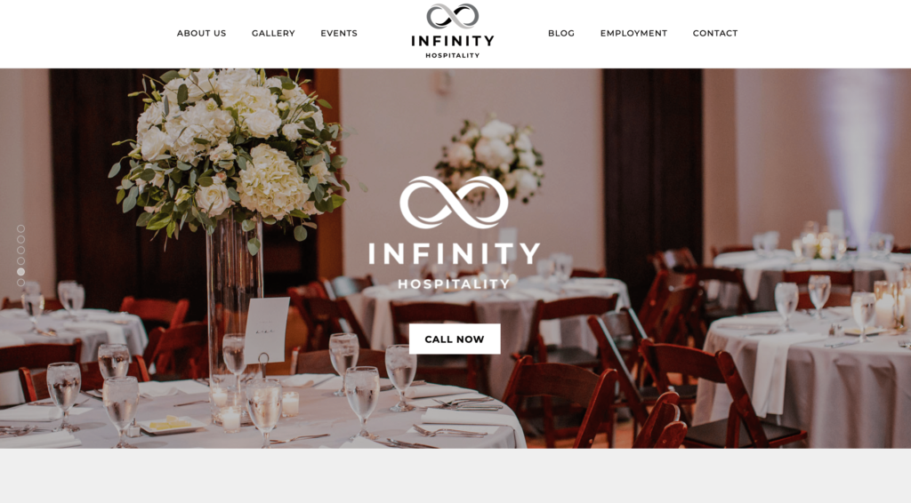
This type of hero image is very popular, and with good reason. The pictures you choose give your audience an idea of the types of events that you plan, and having a slideshow with a few revolving pictures shows your range as a planner while creating interest and movement on the website.
The clear call now button may feel pushy, but keep in mind that a visitor arriving from an ad or search may be ready to get in touch right away with their questions. Potential customers don’t have to search for a way to reach out ” it’s right there, right away.
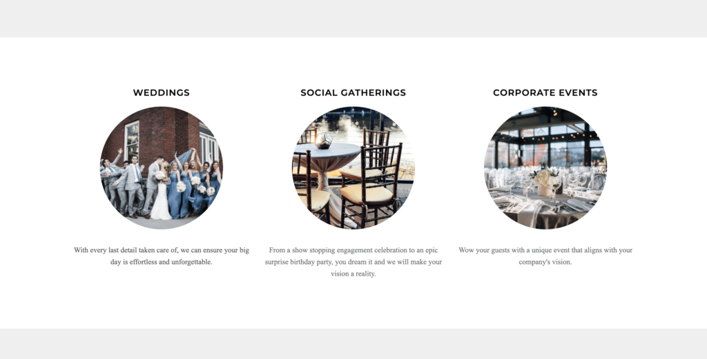
Further down the page, Infinity makes it clear what types of events they plan so that customers will know if they’re the right fit. The images are engaging and well-presented, with clear headlines and brief descriptions underneath, leading to a clean and modern layout. This is an effective way of encouraging potential customers to segment themselves into groups based on the type of event they’re interested in.
2. Brilliant Event Planning
Brilliant Event Planning specializes in planning weddings and events in tents, private homes, and raw spaces. Their website does a great job of telling the team’s story and making their vision clear.
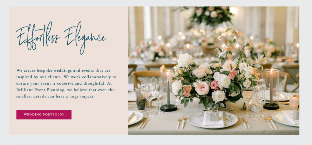
By providing a short description of the effortless elegance of their weddings, Brilliant Event Planning gives their potential clients a clear vision of what to expect. This section also has a prominent call to action button directing visitors to their wedding portfolio so that they can see more examples of effortless elegance in action.
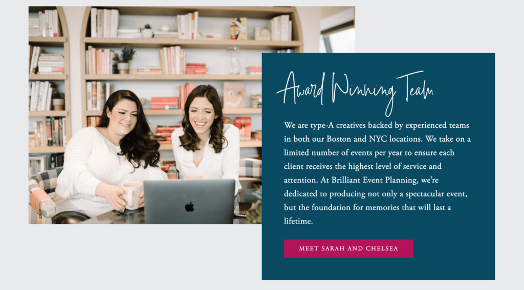
These savvy event planners also include a section on their homepage to speak about their team and how they approach wedding planning. Highlighting your team establishes trust with your audience, and creates a connection with them that can really help in the sales process. By describing themselves as type-A creatives,” the team makes it clear who they are and that they can handle all of the small details that event planning requires.
3. Andrea Freeman Events
Andrea Freeman Events is a full-service event planning and design company specializing in distinctive weddings, luxurious events, non-profit fundraisers, and corporate functions. Their website is simple and distinctive, and immediately stands out.
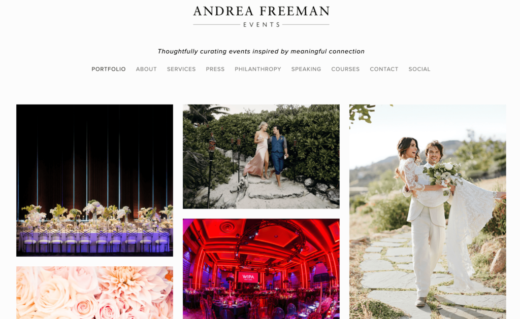
The homepage presents a simple gallery in a mosaic pattern, with images from past events taking up almost the whole page. If you click on any of the images, you’re taken to a description of that event, as well as more images from it. This is a great way of highlighting past work and encouraging potential customers to visualize their own event if it were executed by that event planner.
Additionally, the navigation at the top of the page makes it clear that Andrea Freeman Events has much more to offer, and makes it easy for visitors to decide where to go next for more information.
4. Couture By Design
Couture By Design focuses on events for diplomats, nonprofits, foundations and associations, corporations, and individuals. Their robust website makes it clear that the company is used to events with lots of details to get right ” after all, these are often high-stakes events!
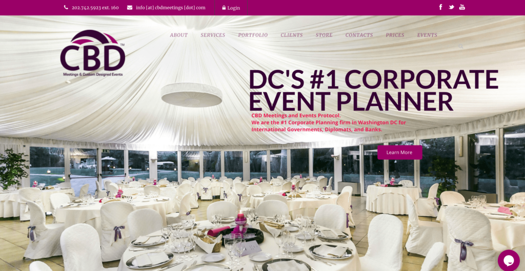
CBD’s website emphasizes trust by highlighting their recognition as the #1 corporate event planner for international governments, diplomats, and banks. They also display their contact information prominently at the top of the page and include a chat function on the bottom right. All of these features give visitors the sense that they can immediately contact the company with questions and be in good hands.

CBD’s website also includes a breakdown of all of their offerings right on the homepage. This makes sense because they organize highly-detailed and complex events for international and diplomatic clients. If your events are particularly complex, highlighting all of the different services you perform can be a helpful way of showing that you are up to the challenge.
5. Mandy Marie Creative
Mandy Marie Creative is a full-service design and planning company for weddings and events. The company’s website is clean, well-organized, and thoughtfully-designed to make navigation effortless for visitors.
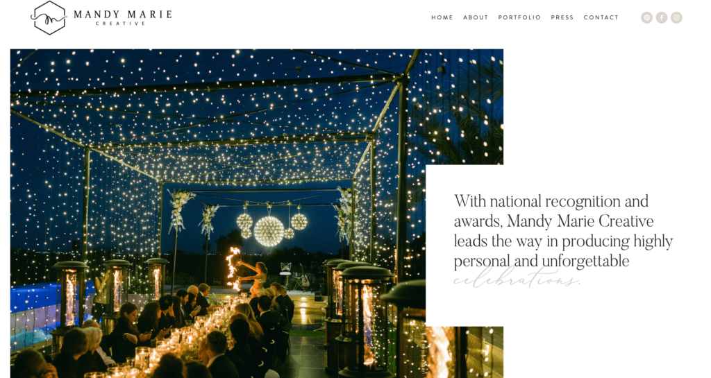
Instead of relying on too many links in the top navigation, they organize into the main categories of “about,” “portfolio,” “press,” and “contact,” and rely on an accordion-style dropdown from each with more links. The cutaway style of the main image on the “about” page is a nice change from the ubiquitous full-screen image, and gives the company a chance to highlight their national awards.
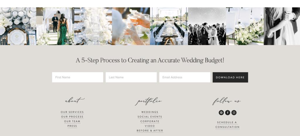
It’s also nice to see Mandy Marie Creative offering a high-value downloadable resource with their “5-Step Process to Creating an Accurate Wedding Budget.” This shows visitors that they understand some of the top questions people have when planning a wedding, and incentivizes potential clients to sign up for their email list. This is classic for content marketing, but still isn’t something that a lot of event planner websites take advantage of.
6. Pearl Events
Pearl Events plans wedding, social, and corporate events in Austin, Texas. The group has a simple and traditional-feeling website focusing on images to convey their message.
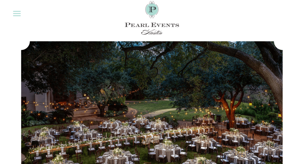
By using a traditional frame shape around their main homepage image, Pearl Events immediately shows that they can put on some amazing classic-styled events (though their “about” page makes it clear that they can do much more ” from “refined and embellished” to “raw and edgy.”). Their logo, font, and messaging are all consistent with the elegant traditional brand feel. In event planner website design, you should make sure that all of the elements work together to create a cohesive look and feel for your brand, which is exactly what Pearl Events does.
7. Kristin Banta Events, Inc.
The website design for Kristin Banta Events is one of the most unique you’ll find, and it works flawlessly.
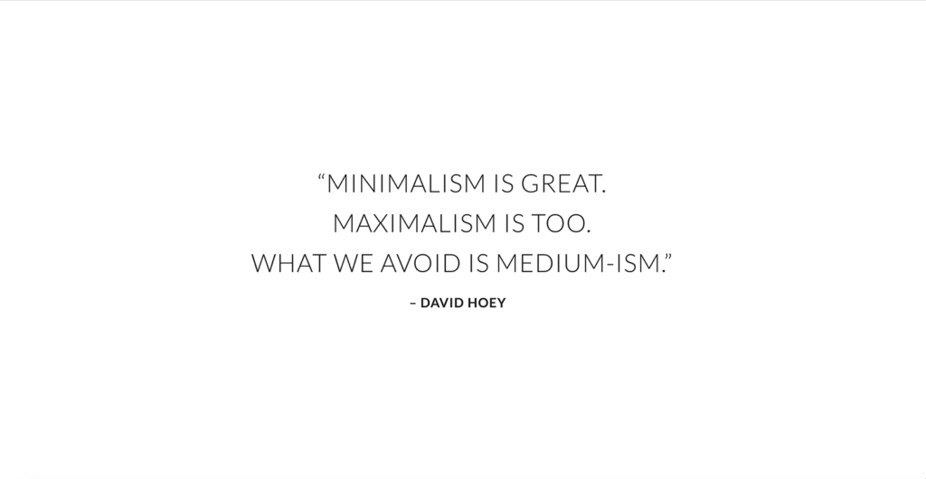
Upon first visiting, users are met with a quote, which reads: “Minimalism is great. Maximalism is too. What we avoid is medium-ism.” This fits the brand ” and the website ” perfectly, and immediately sets potential customers up for a unique experience.
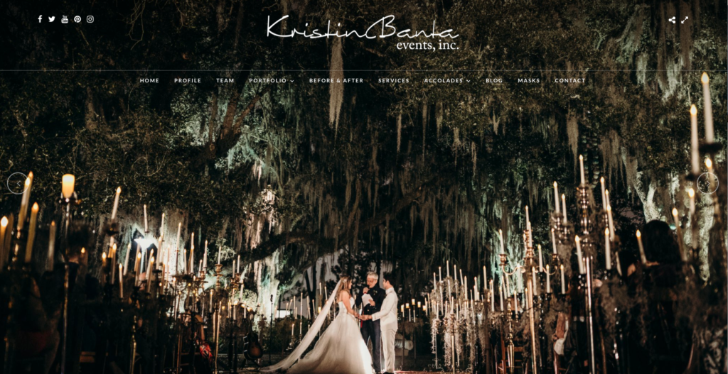
When the website loads, a slideshow of photos from events takes up the entire screen. The only visible text is the brand name and the top navigation bar, fully supporting the notion that a picture is worth a thousand words.
KBE describes themselves as “among the country’s leading event design, planning, and production companies, renowned for uniquely creative concepts, flawless attention to detail and expert execution.” That’s exactly what their website conveys.
These beautiful examples of event planner website design should point you in the right direction!
Need more inspiration? Take a look at some of the most famous event planners in the world, and learn from the best!
