25 Meeting Room Layouts for Events: Tips & Examples
Choosing an event layout can be challenging because it’s such a key part of ensuring your event achieves its objectives. The good news is we’ve narrowed down some the best and most popular meeting room layouts to help you get started. Set the mood and keep things organized with any one of these meeting room diagrams. For each example below, you’ll find advice on how to use it and what it’s best for, and how to create it.
But before we dive into the most successful meeting room layouts, let’s first go over some of the basic information you’ll need during your decision making process.
In this post:
- Key Room Layout Considerations
- Creative Meeting Room Layout Tips
- Meeting Room Diagram Ideas
- Make Event Layouts Online
Key room layout considerations
Here’s what you need to think about before you plan your event layout:
- Headcount: Begin with the guest count or expected number of registrants. Figure out how many people you are trying to fit in your layout.
- Safety and security: Once you’ve got an accurate headcount down, consider what safety features you’ll need. Things like wheelchair access and clear paths leading to emergency exit doors should come to mind.
- Space dimensions: You’ll also need the measurements of the space or spaces within the venue. This might sound like common sense. But it’s tempting to just start planning right away. However once you create a meeting layout you love, you don’t want to suffer from having all your hopes and dreams crushed if you find out it’s not realistic later on.
- Necessities: Then you’ll need to factor in event necessities like decor, furniture, and food. For example, will you be hosting a buffet style dinner? You might want to consider moving your buffet away from the dance floor for easier access.
- Objectives: And finally, keep your event objectives in mind. Each event room layout has its own advantages and disadvantages. Know what you’re going for before diving in.
Creative meeting room layout tips
Regardless of which event layout idea you choose from our options, keep these interesting variations in mind as you go. These simple tips can be applied to almost any layout you choose. Just because your arrangement options are limited it doesn’t mean your creativity has to be too.
- Arrange your tables into unique shapes that resemble your company logo.
- Highlight VIP guest seating with floor risers.
- Visually divide spaces with a mix of table heights. Tall tables go near the bar or dance floor and short tables live around the lounge area.
- Use interesting chairs set ups. Bean bags make for a hip and laid back environment whereas communal or family-style benches help guests mingle and connect.
- Separate areas with lighting. Use eye-catching hues to draw or detract attention where needed.
- Put attendees into groups. Whether it’s by shared interest or age, find ways to help people connect at your event through assigned seating or designated activity areas.
Now that you’ve got those creative event planning gears turning, it’s time to find out which layout is best for your next big event.

Meeting room diagram ideas
1. The Decision Maker
This type of gathering hosts more than two but less than ten participants. One of the biggest concerns organizers have with this kind of event is making sure everyone has an equal say. To help keep conversation flowing equally, choose a round table environment where everyone can be physically equal.
[Tweet “Choosing an event layout can be challenging because it’s such a key part of ensuring your event achieves its objectives.”]
2. The Problem Solver
Slightly larger groups (between 10 and 15 participants) require a point person to keep things on track. For this layout you’ll need to designate a section that acts as the visual focal point of the room. That’s where you’ll seat your meeting facilitator whose job it is to make sure the agenda is completed in a timely manner.
3. The Hybrid
Interested in starting with a group discussion and then breaking out into smaller sub-groups? The hybrid layout is the best of both the decision maker and the problem solver. To begin, arrange your floor plan like the problem solver. You can include a separate area for smaller, round table discussions after the main lecture is over.
4. The Informational
If your event is centered around a larger group of people and something educational, you might have an informational layout on your hands. Diagram your space like a lecture with a group facing a stage. Seat panelists, guest lecturers, or presenters on the stage itself.
5. Cocktail
Hosting a social event? Keep the middle of your floor plan open but leave buffet tables and chairs around the perimeter. Guests will have the option to sit, but with a layout like this they’ll be more than tempted to mingle.
6. Pod Seating
Pod seating is great for small group discussions that require a leader or moderator. You can also use them during seminar breakout sessions to give your attendees some one-on-one time with presenters.
7. Clusters
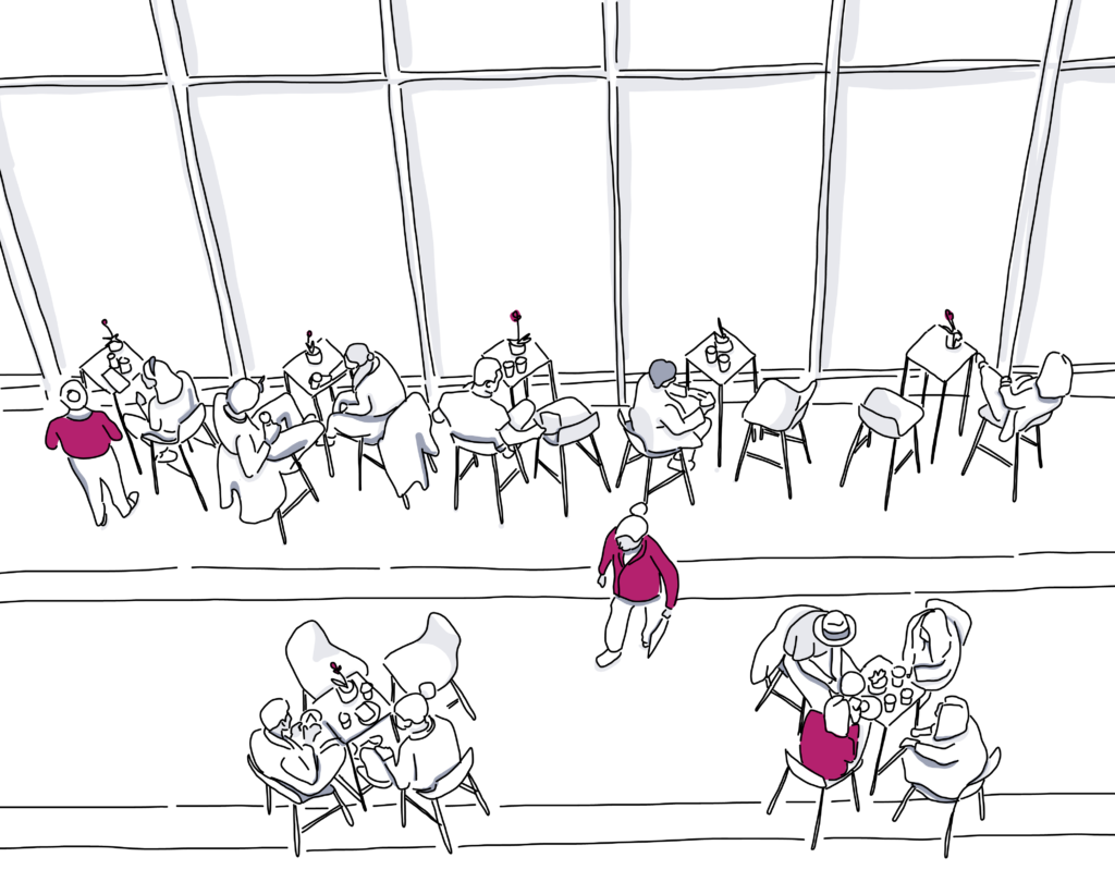
Clusters are another layout that’s ideal for getting guests to mix and mingle. Use high top tables scattered throughout the space with or without chairs. Arrange the tables in such a way that they create a main path for traffic to flow through.
8. Circle
Circles are natural for human beings as they convey a sense of camaraderie and teamwork in a layout that emphasizes equality. Circle layouts are best for full attendee engagement on topics that might require vulnerability or otherwise more personal connection.
9. Semi-Circle
If you choose not to include tables at your event but need a little more breathing room than what the circle layout allows for, give this one a try. Semi-circle layouts are great for groups of roughly 10-40 people. Audience participation is encouraged but not required in this kind of setting.
10. Cafe Style
Small round tables surrounded by three to four seats are what’s commonly used for cafe style layouts. Arrange tables in casual rows so for a relaxed yet intimate atmosphere. Seated lunches during speaker presentations are very much encouraged in this layout.
11. Hollow Square
Create a layout similar to a boardroom style floor plan with long rectangular tables forming a square in the center of the room. Similar to other interactive layouts like the decision maker or the circle, the square puts everyone on equal footing. This arrangement is ideal for professional discussions and group brainstorming.
12. Conference
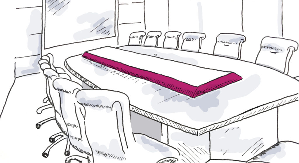
A tried and true layout staple, the conference layout has even been featured in memorable Game of Thrones scenes. Multiple rectangular tables pushed together to create one long surface create a formal atmosphere and set the tone for decision making.
13. X-Formation
An X-shaped layout isn’t used everyday, but maybe it should be! This formation relies on four rectangular tables forming a (you guessed it) X-shape with the option to put a smaller round table at the focal point. If you don’t need a central focal point and want to make things a little more interesting, this might be the right layout for you.
14. U-Shape
This layout often looks like the hollow square but with one side missing. The space in the middle acts like a thrust stage, giving speakers a chance to walk around and connect with individuals around the table. Or it can help facilitate engagement between attendees.
15. Broken Horseshoe
Similar to the traditional U-shape or standard horseshoe layout, the broken horseshoe looks like the U-shape except for the fact that it has a detached desk at the opening of the arrangement that faces the rest of the group. Use this layout for smaller versions of meetings that don’t have the space for the boardroom layout or want to use a single facilitator at the head of the arrangement.

16. Theater
A favorite for corporate events or very large groups, theater layouts put the attention on the group (usually arranged in neat, evenly spaced rows) on to the front of the space. With or without a stage, this layout is great for presentations, lectures, and product demonstrations.
17. Banquet
Planning a seated meal? A banquet layout might be just what you need. How many people you arrange at each table depends on the table measurements. Remember to leave plenty of elbow room!
18. Imperial
The imperial layout is basically the broken horseshoe but with chair places on the inside and the outside of the shape, with head table still facing the rest of the group. Also great for meals, the Imperial makes cafeteria style dining more interesting.
19. Runway
Even if your event isn’t a fashion show, the runway layout is a dynamic arrangement ideal for performances of any kind. With or without tables, your audience will be included in the action without having to directly participate.
20. Classroom
Small rows of tables or chair arranged end-to-end facing a single direction might seem old school (pardon the pun) but this layout could be just what you need for your next big event. Make sure you give your attendees some kind of surface to write on if they plan to take notes. Staggered seating helps keep sightlines clear for those in the back.
21. Tiered Classroom
A hybrid of the classroom and theater layouts, the tiered classroom arrangement makes for a more focused experience than perhaps either of its counterparts. Moving the tables and/or chairs to face slightly more towards the center where the speaker or presenter is makes is easier for them to observe and interact with the group.
22. Triangle Classroom
The last in our school-inspired layouts, the triangle classroom keeps tables and chairs to a few seats but this time there’s a big walkway running down the middle towards the presenter. Some planners choose to arrange couches in this formation as it feels more college than kindergarten in nature. While attendees can participate they’re more likely to kick back in this layout.
23. Crescent
The crescent or half-moon layout is reminiscent of the banquet layout but with half the chairs missing at each table and on a much smaller scale. Great for meals, presentations, and break out sessions without guests ever having to get out of their seats.
24. Lounge
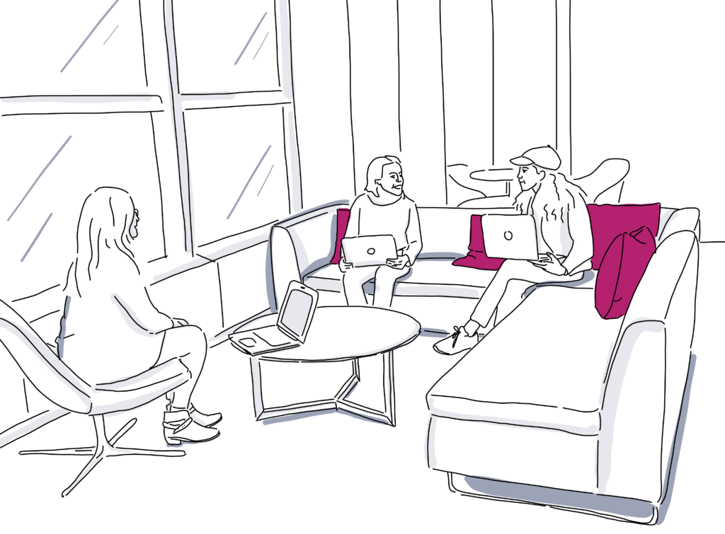
As the name implies, lounge layouts prioritize relaxation over productivity. Usually comprised of low level seating, a lounge layout leaves enough room for couches, chairs, and standing areas alike. Use this layout for informal networking sessions or VIP sections that help guests catch a break from the main hustle and bustle.
25. Mixed Seating
While this can be casual like the lounge layout, a mixed seating layout has more to do with chairs and height than anything else. Use chairs at different levels throughout the space to designate chillout spots. Artistic and eye-catching furniture or quirky decor make this layout both fun and functional.
No matter which layout you choose, keep these points in mind when diagramming your next event:
- Decide the level of formality your event requires to help narrow down options.
- Choose whether or not you want attendees to connect emotionally, professionally, or both.
- Let your event objectives have the last say in what layout you choose. Need people to mix and mingle? Open floor space, a variety of chair heights, and use of banquet tables are a great option. Need attendees to complete a project or task? Desks arranged in square or U-shaped formations help foster collaboration with or without a facilitator.
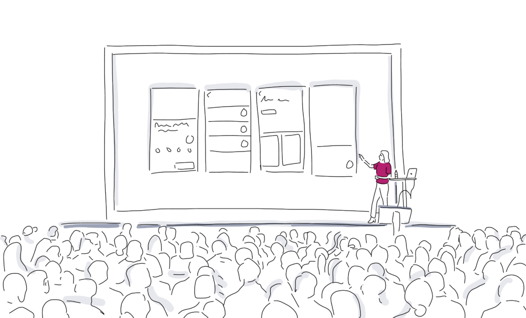
Make event layouts online
One way to streamline your event planning and save a ton of time is to use event layout software. With tools such as Social Tables you can create your layout and view it in 3D. When you create an event diagram, it’s such a helpful tool for simplifying event detailing for your team, customers, AV, and vendors. Plus, it makes it easy to keep track of all that furniture
One advantage of using Social Tables is that you can plan your event layout online with your clients. You can give them access to see the layout on their computer while you make edits to it on yours. That also makes is super simple to handle any last minute changes, say if another guest rsvps.
Our diagramming software also lets you swap your existing layout into a different floor plan effortlessly. Take a look at the image below to see the new feature in action.
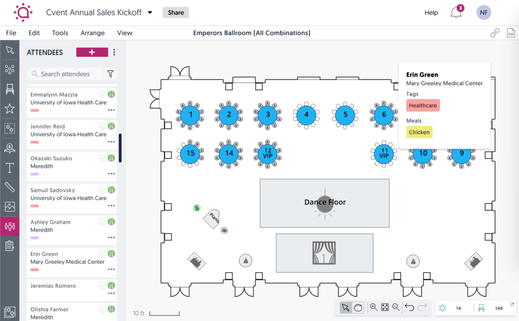
Simply access this new Swap Floor Plan option from either the File menu or by right-clicking the desired floor plan from the left panel. You know better than anyone”last minute changes happen. Now, that doesn’t have to mean hours and hours of lost work.
Now that you know the types of event layouts, how to best use them, and how to bring them to life, you’re ready to move to the next stage in planning your event!
Events are all about helping people build relationships and have a good time. As long as you keep this in mind, you’ll always make the right decision when it comes to your event layout.
Still need answers about meeting room layouts?
Meeting rooms should be set up according to their primary purpose, but some common rules you can apply are:
– A way to present
– A whiteboard
– Sufficient table and chair space for attendees
There are truly countless options when it comes to styles for setting up meeting rooms. Board room table, tiered classroom, broken horseshoe, X-shaped, and Imperial are just a few.

