What’s New: A Fresh Redesign That Brings the Future to Diagramming
What if the world’s most popular diagramming tool got even better and easier to use? It was this thinking that led to the redesign of Social Tables Event Services Solution. Thanks to great feedback from customers, Social Tables has taken event diagramming to the next level of quality and sophistication with a fresh new look, improved templating tools, and more intuitive user controls. Take a look at some of the great new updates below.
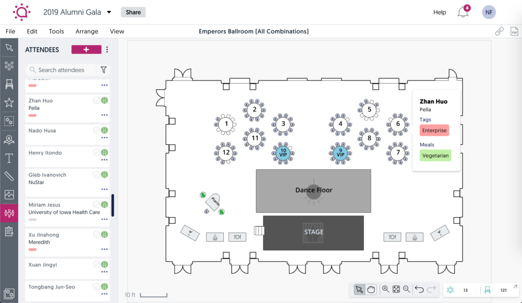
1. Improved look and feel
With this update, your diagrams will now be brighter, cleaner, and easier to understand. Here’s a look at the fresh redesign in action.
2. A convenient left-hand panel
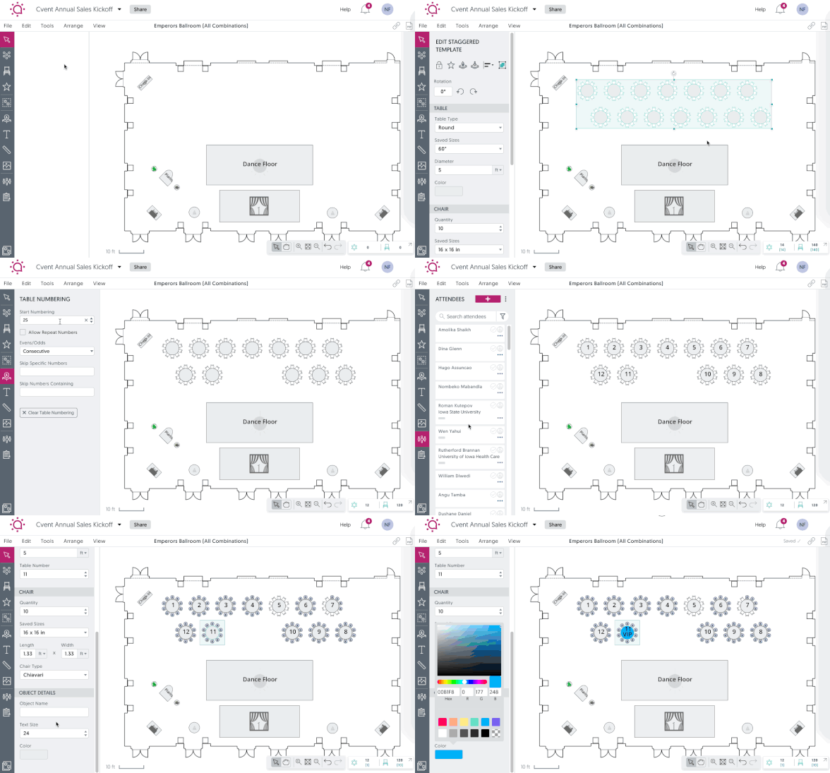
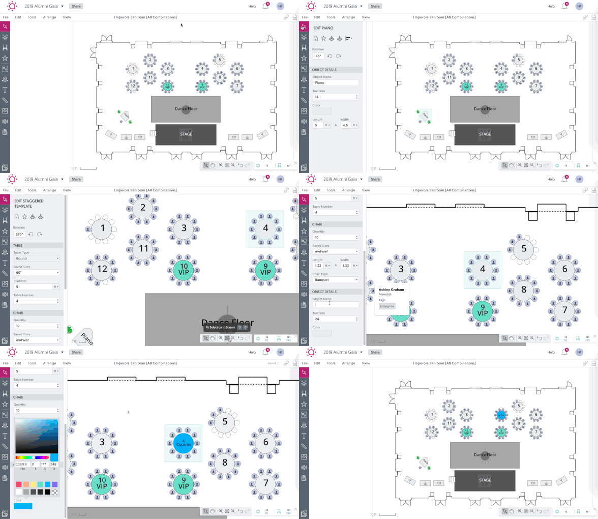
We’ve simplified all of your important workflows. Now, all objects, tools, and editing functions can be found on the left-hand panel. When you place a template, you can change its size, spacing, and color without ever navigating to another part of the application. Here are a few examples in action:
Here’s how to edit a template
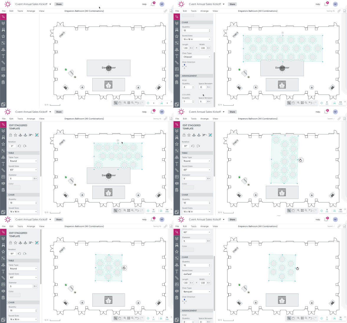
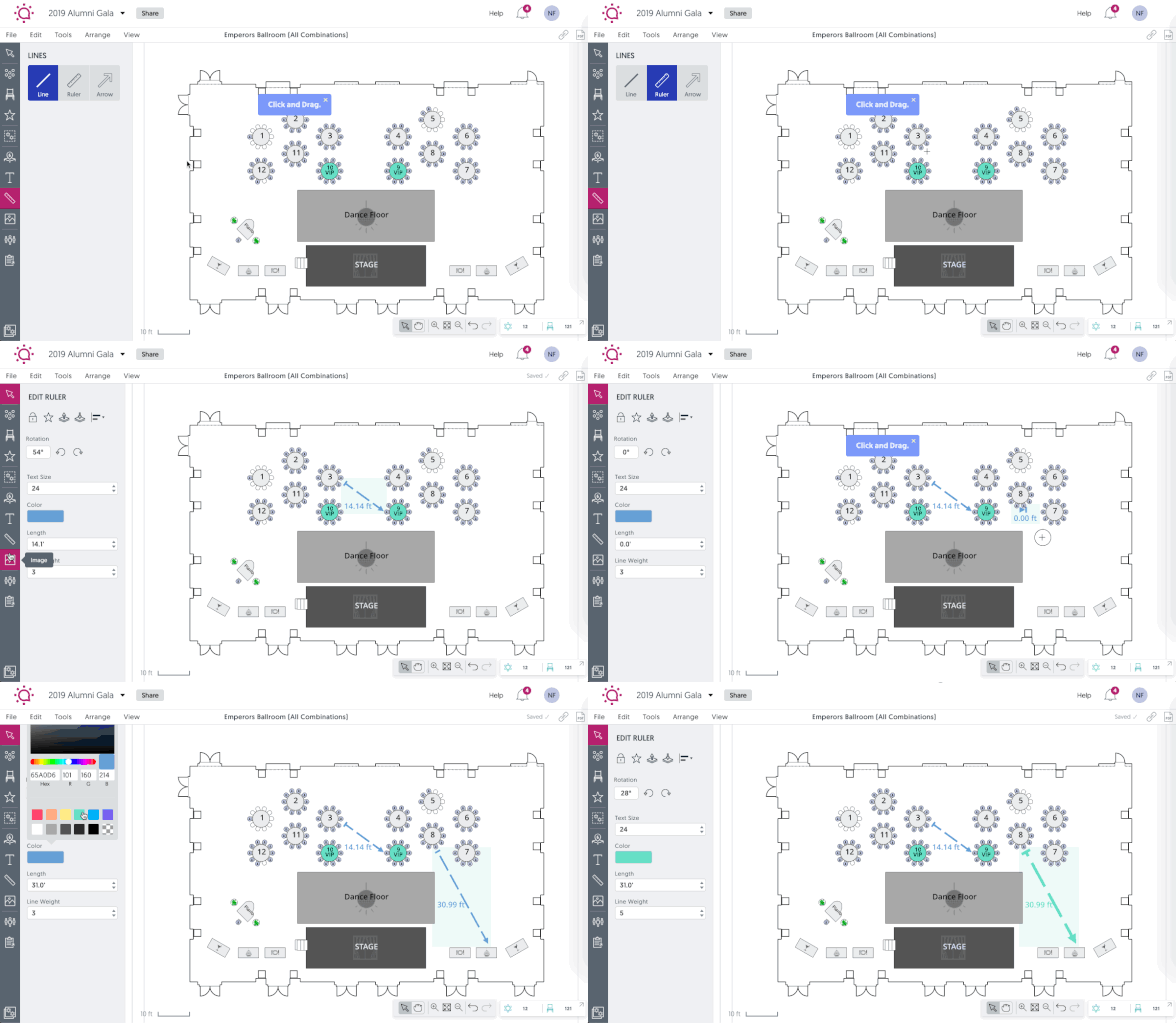
Here’s how to use the ruler
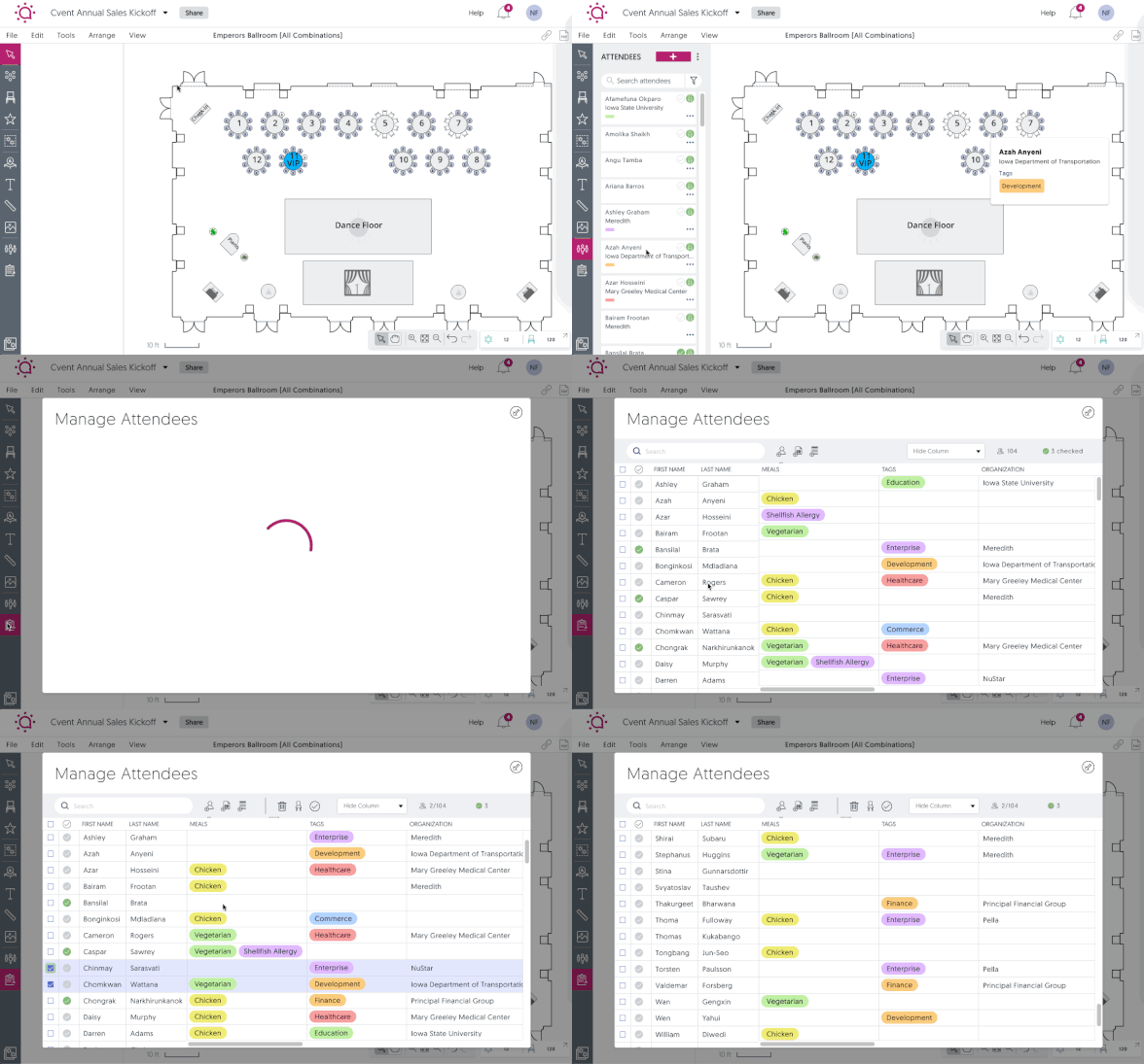
Here’s how to manage attendees
3. A simpler equipment list
The only important feature not located on the left-hand panel is the equipment list, which is permanently located in the lower right-hand corner of the screen. You can see which objects are currently placed in your diagram, and even zoom in on particular objects for fast editing.
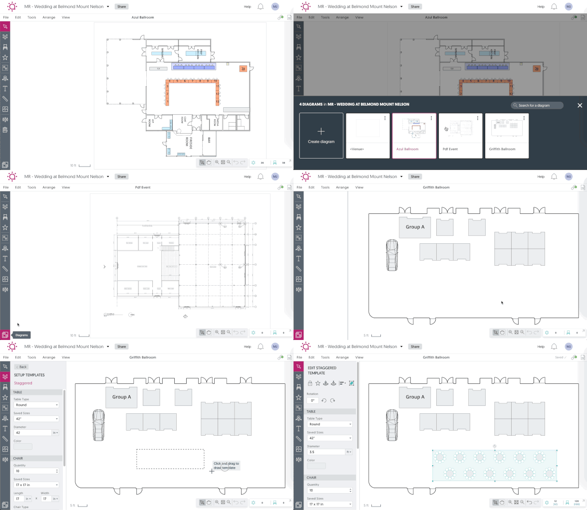
4. Ability to switch between rooms
It hasn’t always been intuitive how to switch between rooms”but it sure is now. Simply click the icon in the lower left-hand corner of the application to choose between all the diagrams associated with your event.
Many of our customers have the option to try out the new look today. Just log into your account and look for the Get Access Now button. Click it and experience the difference for yourself today! If you’d like to create an account to give it a try, get started here.

